When you land on a website, you need certain information quickly to help you make the decision whether to stay or go. As a website owner, you need to know what your visitors need to know, to help them to make the decision to stay and reduce your website’s ‘bounce rate’.
While web design has evolved over the years, visitor behaviour still relies on engagement.
Put your other hat on – the one where you’re visiting someone else’s website. When you land you want to know:
- Are you on the right website?
- What does the company do?
- What’s in it for you?
So that’s what needs to be visible on the first page. The company’s name/brand at the top, something above the ‘fold’ that tells you what they offer and what you get – or at least the kind of problems they help with.
What you don’t want:
- Whizzy graphics
- A video that launches without you asking it to with no indication of how long it lasts
- Not enough information to understand what’s on offer
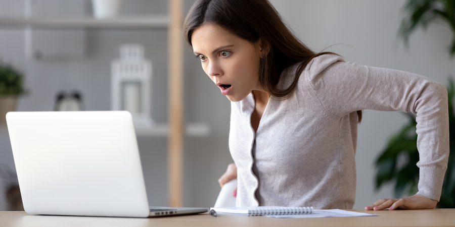
Every picture tells a story
Images are powerful – but only if they’re relevant.
This means that you need to invest time and thought into finding images that help to get your message across and aren’t just ‘eye-candy’.
Moving picture a.k.a. scrolling marquees can actually dislodge your visitor. It’s popular to have an image across the top of the page, sometimes with a headline across it. That’s fine, but if every couple of seconds that whips away to be replaced by another one, that can cause too much distraction for your visitor.
With stop-start motion, every time movement starts again, the visitors eye is pulled back to the image. If they’re just trying to read the content below the image, that’s not good news, because then they’ve lost their place. Most of us will only give it a couple of goes before giving up.
The best you can hope for is that the visitor will click to another page on your website, but if they haven’t processed what their next step is, they’re more likely to just exit the site and find something ‘easier’.
Where text wraps around an image, make sure the image is on the right so the visitor reads into it. When the image is on the left, the eye tends to scan down an image, rather than across it, then reading starts underneath – meaning the introductory part of the message can be skipped altogether.
What’s the moral of this tale?
Think like a visitor when briefing your website designer – and ensure your site is really ‘sticky’, not the equivalent of a trampoline!