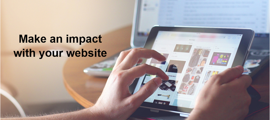
 The look and feel of websites has changed over the years. Gone are the days of long copy for the search engines and pages that look like articles. Today’s websites are colourful, video-rich with short, punchy copy and informative blogs.
As a writer and someone who has studied readability (what stops people getting your message), there are some elements of modern websites that I dislike. I still look at most sites on a desktop screen, but when you take into account how websites are viewed on a mobile device, the new designs come into their own.
These are some of things that you should consider if you’re giving your website a make-over.
- If you start with a big colourful image – make sure that it’s relevant to your business and has one compelling headline visible above the ‘fold’ (i.e. on the first screen that is presented). No message means you’re making your visitor work too hard to find out more. Too many messages can confuse them – resulting in them thinking ‘let’s go somewhere easier’.
- If your image is one of a series, get your web designer to make the transition from one picture to the next a slow fade in and out. When the image changes abruptly it is distracting, especially if part of the image is still visible when you’ve scrolled down a bit to read the message below. Effectively, you’re putting a barrier in front of your message.
- Make sure that the next item on your home page is an introduction – but don’t head it up ‘Introduction’! Give it an interesting headline and then you need 2-3 short paragraphs focused on the benefits your visitor can experience or the problems they can get solved from exploring further.
- On the subject of headlines, every page needs one. ‘Services’ is not a headline, it’s the page title. Yes, the search engine needs that on the page, but the human visitor has clicked on that tab or a button that has told them that’s where they’re going, so they don’t need to be told where they are. They do need a reason to start reading so the biggest headline on the page needs to be the hook to pull them in.
- Every page also needs images. They give the page energy and life and encourage the reader to stay put and find out more. However, they must be relevant to the page content, so choose carefully. Be creative, you can use simple diagrams, models, charts or video clips.
- If you have text alongside an image the text goes to the left, the image to the right. This ensures people read towards the image, rather than scan down and start reading underneath it.
- Use short paragraphs – 3-5 lines – and plenty of white space. Ask your web designer to wrap paragraphs around 100 characters (at 12 point) to make reading easier. Very long lines make reading uncomfortable as the reader has to move their head to scan the line – and finds it harder to pick up the next line.
- Don’t forget to include a call to action at the end of every piece of text. What do you want your reader to do when they’ve read this bit? Call you, complete an enquiry form, visit another page, read your blog, sign up to your free download? Tell people what to do – and make it easy for them to do it (the phone number in the call to action or a link to the next place you want them to go).
These are just a few things that will make your website engage your visitor – and help to turn them into an enquiry.
