I write lots of web content and work with clients and web designers on making websites user-friendly. That may seem obvious, but sadly the surveys reveal that, offered the option of a glitzy, pretty website and one that has fantastic usability for the website visitor, the looks win out over the user experience.
What’s this got to do with written material? Surely that’s a problem for the web developer or designer or both? Yes, it should be – but at the end of the day few developers conduct user tests and almost none get training in how people use websites.
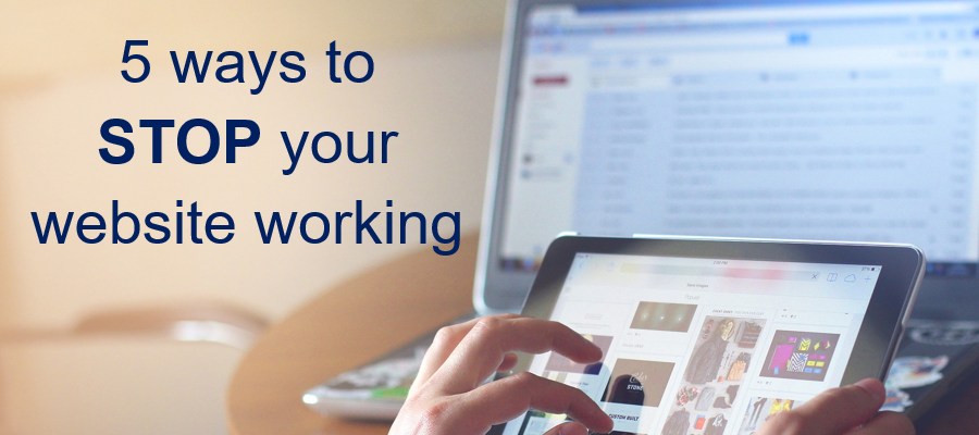
Here are some common mistakes that people make when constructing their website:
- Too much going on at once
With scrolling or sliding banners, moving headlines, flashing icons you are actively discouraging the reader to leave. Anything that moves should move ONCE and then stay still. If you have changing images ask your web designer to slow the transition down to a very, very gentle dissolve so that the reader barely notices and can focus on what THEY want to see. - Creative menu tabs
Navigation should be a no-brainer – as in you shouldn’t have to have to think twice about what the menu tab says. So – About us (or About) not Company Profile or Who we are or Meet the Team. Visitors should be able to take one look and know what to expect if they click the tab. - Too many options on the menu
Most people are short of time and don’t want to spend any more minutes than necessary reading a long menu. As most menus today run across the page it doesn’t limit how many tabs you can have, but some designers simply pull out some of the tabs and create a second menu above the main banner or elsewhere. Some people also put another menu in the footer. The record I’ve found so far were SIX slightly different menus on one page! - No calls to action
Before you construct your site map you should know what you want people to do before they leave your site. Then, as you construct the site map ask yourself how easy it is for them to do that. When you write the content (or brief someone else to write it for you) every page should ask the reader to take action – whether that’s to move to another page, visit the blog, download a free item or call you to discuss their needs. If you don’t ask, you don’t get! - Making your visitor work too hard
Many websites feature a Testimonials page and others have a comprehensive FAQs section. Testimonials should be on the page where the service being discussed is featured. Third party validation is powerful – but don’t make your reader have to work that out and go and read a long list of testimonials (which may or may not be about the product or service they’re particularly interested in).
FAQs are lazy – if you think that people will want to know the answer to a question that means the copy on the site isn’t doing its job properly. The answers should be part of the main copy. Also – if you are giving people all the answers, they don’t need to get in touch – and you miss the opportunity to open a conversation. There is such a thing as too much information.
These are just a few things that will send people away from your website – but get these right and your website will work harder for you.